Print vs Web Images - Everything That's Actually Different
A screen hides the limitations of a low-resolution file because its pixel density is fixed - an image only needs to be sharp at the monitor's native resolution to look crisp. Print has no such forgiveness. Paper requires a pixel density that screens don't demand, and no software trickery can invent detail that wasn't captured in the first place. Moving an image from screen to paper moves it from a world of light and pixels to one of ink and dots, and the two don't behave the same way.
The DPI/PPI Myth
The terminology surrounding resolution is often used interchangeably, but there are distinct differences between the digital and physical units of measurement. Understanding these differences is the first step toward debunking common industry myths.
The persistent idea that web images must be set to 72 DPI is a relic of 1980s computing. The original Macintosh display had a resolution of roughly 72 pixels per inch, which meant one typographical point (1/72 of an inch) matched one pixel on the screen. That alignment stopped mattering decades ago as monitor densities diverged. A digital display ignores the DPI tag in an image file entirely: a 1920x1080 image looks identical on your monitor whether its metadata claims 72 DPI, 300 DPI, or 1 DPI. Browsers render images pixel-for-pixel or scale them via CSS based on dimensions, not metadata tags. On a screen, total pixel count is the only metric that determines size and clarity.
DPI only becomes a functional constraint during the printing process. High-quality materials like magazines and brochures require 300 DPI for sharp results. Newspapers often utilize 150 to 200 DPI due to the absorbent paper stock and greater viewing distance. Large-format items, such as billboards or trade show banners, are typically printed between 72 and 150 DPI. Because these are viewed from several feet away, the human eye cannot distinguish the lower density, whereas a very low resolution like 13 DPI remains visibly pixelated.
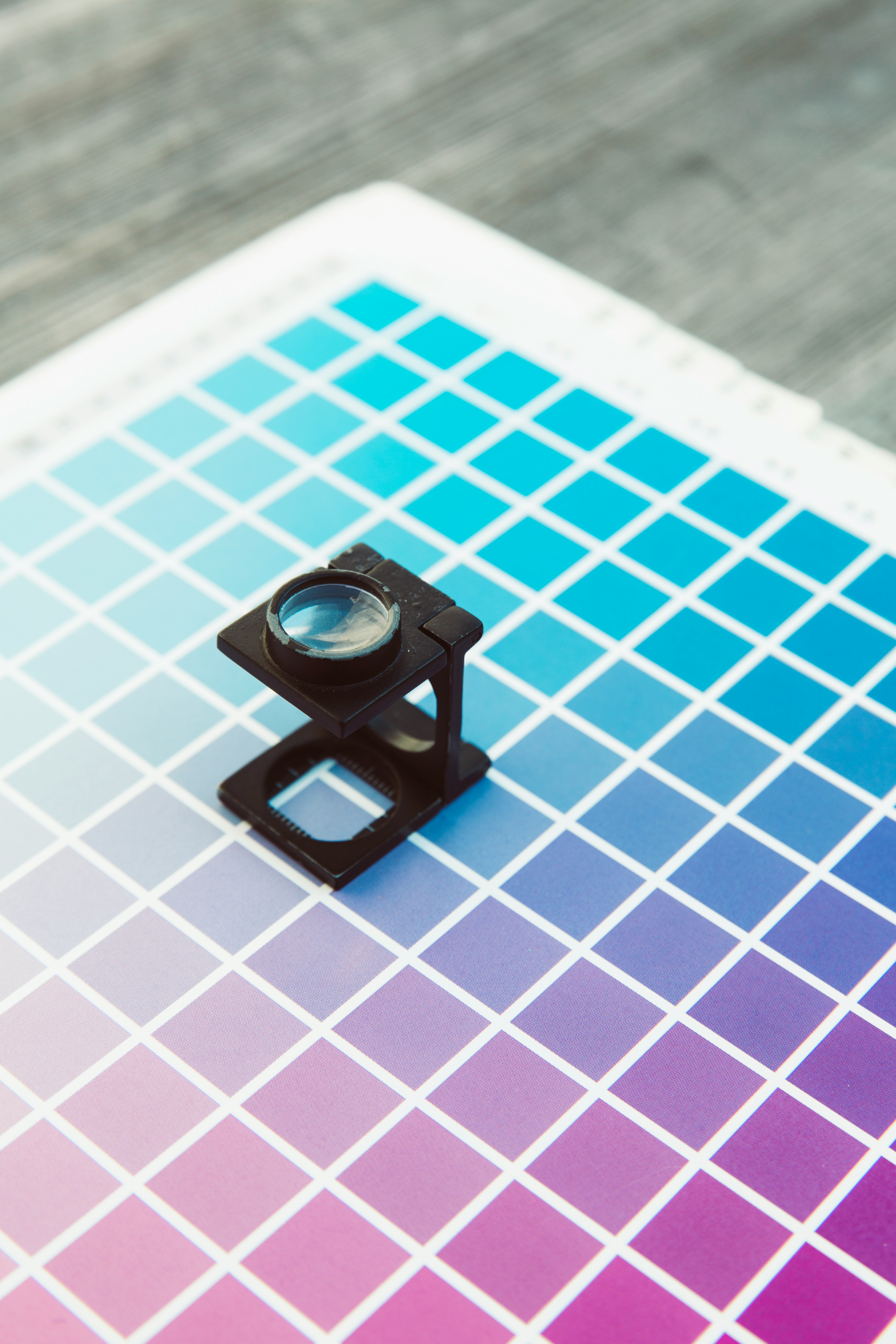
RGB vs CMYK Color Gamuts
Your monitor produces color by blending red, green, and blue light through the RGB additive color model. Starting with a black screen, adding all three channels at full intensity results in white. This model provides an enormous gamut, including the vivid, highly saturated shades of blue, green, and orange that make digital images vibrant.
In contrast, a printer produces color by layering cyan, magenta, yellow, and black ink on paper using the CMYK subtractive model. Starting with white paper, ink is added to absorb light and create color. Because the CMYK gamut is substantially smaller than RGB, many colors your monitor displays cannot be reproduced with ink. Highly saturated tones are the most affected; a vivid electric blue on screen will often print as a muted navy.
This shift is a physics constraint rather than a quality issue, as light mixing and ink mixing are fundamentally different processes. When converting an image from RGB to CMYK, the colors are pulled inward toward the reproducible range, which typically makes the image appear slightly muted compared to the digital version.
If you are designing for print, you should work in CMYK from the start or utilize soft-proofing to ensure the final conversion is predictable. For web design, always remain in RGB. There is no benefit to using CMYK for screen display, as browsers may not render the colors correctly and file sizes will be unnecessarily larger.
Resolution Requirements: The Pixel Math
To determine how large an image can be printed at a specific quality, divide the pixel dimensions by the desired DPI. This straightforward calculation provides the physical limits of an image before clarity begins to degrade.
A 4000x3000 pixel image printed at 300 DPI results in a print approximately 13.3 inches wide and 10 inches tall. This size is ideal for brochures or high-quality photo prints. The same image at 150 DPI produces a 26.7 by 20-inch print, which is sufficient for a poster viewed from a distance of a few feet. At 72 DPI, the dimensions increase to 55.6 by 41.7 inches; this resolution works for large-format banners as long as no one looks too closely.
Here's a quick reference for common print sizes at 300 DPI:
| Print Size | Recommended Resolution (Pixels) |
|---|---|
| 4x6" print | 1200 x 1800 minimum |
| 8x10" print | 2400 x 3000 |
| 11x14" print | 3300 x 4200 |
| 16x20" poster | 4800 x 6000 |
| 24x36" poster | 7200 x 10800 (at 300 DPI - but 150 DPI is often fine at this size) |
The Limits of Upscaling
While software allows for the input of larger dimensions in the image size dialog, it cannot invent non-existent detail. When upscaling a 1200-pixel-wide web image to 6000 pixels, the application must estimate the data between existing pixels. Traditional resampling methods, such as bicubic or bilinear, produce smooth but blurred results. While the pixel count increases, the actual information within the file does not.
AI upscaling tools, including Topaz Gigapixel and Adobe Super Resolution, are more effective at adding plausible detail by predicting what a sharper version of the image might look like based on extensive training data. However, these tools still rely on estimation. They can hallucinate textures, smooth over fine details, or introduce artifacts that appear acceptable on a screen but become obvious in a 300 DPI print.
☞ Rule of Thumb: You can typically upscale an image by 2x and achieve acceptable results using a high-quality AI tool. Beyond that, the outcome becomes unpredictable. If print quality is a priority, you must start with sufficient pixels, as there is no substitute for original sensor data.
File Formats for Web vs Print
Web images need to be small. Every kilobyte adds to page load time, and load time affects everything from user experience to search rankings. The priorities: compression efficiency, browser support, acceptable quality at small file sizes.
- WebP is the default choice in 2026. Excellent compression, supports transparency and animation, and every modern browser handles it. Typically 25-35% smaller than equivalent-quality JPEG.
- JPEG remains the universal fallback. Broad compatibility, good compression for photographs, widely understood. Quality 75-85 is the sweet spot for most web use.
- PNG for anything requiring transparency or pixel-perfect accuracy - logos, UI elements, screenshots, graphics with text. Lossless but large for photographs.
- AVIF is gaining ground as the next-generation option with even better compression than WebP, but browser support still has some gaps.
Print images need to be high-fidelity. File size is almost irrelevant - nobody's downloading your brochure layout over a 3G connection. The priorities: color accuracy, maximum detail, compatibility with professional print workflows.
- TIFF is the gold standard. Lossless, supports CMYK, supports 16-bit color depth, widely supported by every print shop on the planet. File sizes are enormous, and nobody cares. If a print shop asks for your files and you send TIFFs, they'll appreciate it.
- PDF for anything combining images with text and layout - brochures, posters, business cards. Use PDF/X standards for print-ready files. A good PDF embeds fonts, preserves color profiles, and gives the print operator exactly what they need.
- High-quality JPEG works in a pinch. JPEG does support CMYK color data, and Photoshop can save CMYK JPEGs - but many web browsers and consumer image viewers won't display them correctly, so CMYK JPEGs are mainly useful in print workflows. If you use JPEG for print, save at quality 95-100. Every re-save introduces more compression damage.
- PSD/AI for working files a print shop might need to adjust. Not output formats, but some workflows expect them.
In short: web formats throw away data intelligently so files load fast. Print formats preserve everything so the physical output is as accurate as possible.
Bleed, Trim, and Safe Zones
If you have never sent a file to a professional print shop, these terms are essential for ensuring your project is accepted and printed correctly.
Trim line
The trim line is the final dimension where the paper is cut. For a 5x7" postcard, the trim line defines that specific rectangle.
Bleed
Bleed is the extra area beyond the trim line, typically 0.125" on each side. Anything extending to the edge of the finished piece must continue into this area to account for cutting inaccuracies. If a background stops exactly at the trim line and the cut is slightly off, a white sliver will appear on the edge.
Safe zone
The safe zone is the area inside the trim line where all critical content should remain, usually 0.125" to 0.25" from the edge. Keeping text and logos within this margin prevents them from being accidentally cut off or appearing too close to the edge.
A 5x7" postcard with standard bleed is set up as a 5.25x7.25" document. While the image fills the entire area, only the inner 5x7" section is the finished product, and all headlines should remain within the 4.75x6.75" safe zone. Getting these measurements wrong is a primary reason print shops reject files.
Web images don't need these margins since the edges of a digital image are absolute. There is no cutting or physical tolerance involved, so the dimensions you see in the browser are exactly what the user receives.
Starting From a Single High-Resolution Master
The foundation of a professional workflow is starting with the highest quality source possible-high-resolution, RGB, and minimal compression. From this master file, you can derive both web and print variants with precision. While downsizing for digital use is a trivial task, attempting to upsize a web-optimized image for print is often impossible without significant loss of quality.
Maintaining a library of original high-resolution files allows you to automate your output. You should establish specific export presets: one for web using sRGB and appropriate dimensions in WebP or JPEG, and another for print using CMYK or Adobe RGB at full resolution in TIFF or high-quality JPEG. By letting conversion tools handle these mechanical shifts, you ensure consistency across different mediums.