Color Spaces Aren't Abstract - They're the Reason Your Prints Look Wrong
Many photographers experience a jarring disconnect when a masterpiece on a calibrated monitor fails to translate to paper. While an image might look incredible on screen with vibrant tones and perfect balance, the physical prints often return from the lab looking flat and incorrect. Greens appear muddy, skies shift toward a dull cyan, and turquoise water loses its brilliance.
This failure occurs because an image edited in a wide space like Adobe RGB requires a specific conversion to a printer profile during export to maintain its appearance. Without that translation, the printer cannot reproduce the colors the monitor displayed. This gap between digital perfection and physical output is the core of the color space problem.
What is a Color Space?
A color space is a mapping system that defines which real-world color corresponds to a specific set of numbers. A pixel value like R:0, G:200, B:80 is meaningless without context. In sRGB, that value represents a specific shade of green. In Adobe RGB, those same numbers point to a different, more saturated shade of green.
Think of these values like coordinates on a map. The numbers "42.5, 12.8" could indicate central Italy or the middle of the ocean depending on the coordinate system used. While the numbers are identical, the location is completely different.
ICC profiles act as a map legend that tells the application exactly how to interpret the pixel values in a file. If you remove the profile, the application has to guess the color space. Most apps assume sRGB because it is the standard for the internet. If your file was actually Adobe RGB, the colors get reinterpreted through the wrong lookup table and look desaturated.
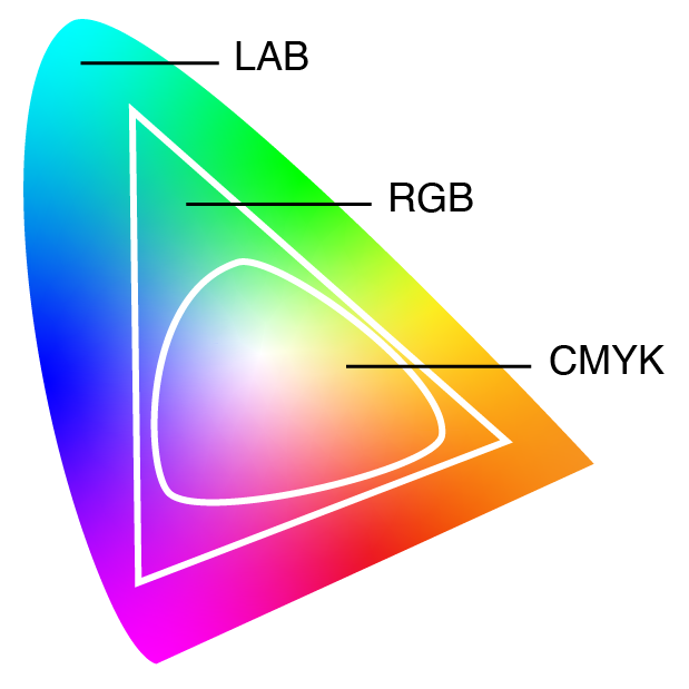
The Four Color Spaces You'll Encounter
These are the four primary color spaces you will encounter in a modern photography workflow:
- sRGB. HP and Microsoft created this standard in 1996 for monitors and the internet. It covers about 35% of the visible color gamut and handles everyday colors well. It remains the default for nearly every screen, browser, and web platform.
- Adobe RGB (1998). This space covers roughly 50% of the visible gamut. The extra range is concentrated in the cyan-green region, which makes it popular with landscape photographers. It was designed with CMYK printing in mind to match what high-end inkjet printers can reproduce.
- ProPhoto RGB. This is the largest common space and covers roughly 90% of the visible gamut. It includes imaginary colors that cannot physically exist and serves as the preferred working space for high-end retouching in Lightroom. You must use 16-bit files to avoid visible banding in gradients.
- Display P3. Apple introduced this space around 2015 to provide about 25% more range than sRGB. The extra color is concentrated in reds and greens. While modern mobile screens and MacBooks can display P3, browser support is still inconsistent.
What Happens When You Convert
Converting between color spaces is a mathematical shift. Your software translates each pixel to a universal color reference and then fits it into the new space. Colors that exist in both spaces stay the same. Colors that only exist in the original space are too vibrant for the new container and must be handled through rendering intents.
Relative ColorimetricThis method pulls colors that are too bright or saturated down to the closest possible match in the new space. It keeps the colors that already fit perfectly accurate, but it can flatten details in very bright areas where different shades get pushed into the same limit. This is usually the best choice for images going on the web.
PerceptualThis method shrinks the entire range of colors so they all fit. It keeps the relationship between different shades the same even if the individual colors change slightly. This is generally better for physical prints with many deep colors because it keeps smooth transitions instead of creating harsh, flat patches at the edges of what the printer can handle.
The result is that moving from Adobe RGB to sRGB is a one-way street. The extra green and cyan data is replaced by simplified values and cannot be recovered by switching back later. Moving from sRGB to Adobe RGB adds nothing new. The software just recalculates the numbers to represent the same colors in a larger box, which is like pouring a small cup of water into a large bucket.
The Untagged Image Problem
An untagged image lacks an embedded ICC profile and can lead to significant display errors. Without this profile, the image file is simply a collection of numbers that a computer could interpret in several ways.
Most software defaults to treating untagged images as sRGB. Photoshop provides a warning, while Lightroom and web browsers quietly assign the sRGB profile. If the file was originally sRGB, the colors will look correct. However, if the file was created in Adobe RGB, every color will look slightly wrong. This often happens with older cameras that strip profiles during JPEG export. The image will appear washed out because Adobe RGB values produce less saturated colors when they are forced into an sRGB scale.
The fix is straightforward because you should always embed the profile. JPEG, TIFF, PNG, and WebP all support embedded ICC profiles. When you prepare images for the web, you must embed the sRGB profile. Even if you believe a browser will assume sRGB automatically, you should still convert the data and embed the profile to ensure the colors remain consistent.
The Web Is Mostly sRGB
This reality is often the biggest source of frustration for photographers. You can shoot in Adobe RGB, edit in ProPhoto RGB, and create a stunning file with a wide range of colors, but the moment you upload it to Instagram or a website, it will likely be displayed as sRGB. In the worst cases, the site might re-encode your file without converting the profile, which turns your carefully saturated greens into a muted olive.
Modern browsers like Chrome, Firefox, and Safari have improved their color management, but a browser supporting a feature does not guarantee that every user's monitor will handle it correctly. The safest workflow for web images is to convert the file to sRGB, embed the profile, and then export. If you want to provide wide-gamut images for advanced displays, you can use technical solutions like CSS and Display P3 profiles, but you should always include an sRGB version as a fallback.
Many photographers use Adobe RGB because they want the best quality, but they feel confused when their online portfolio looks duller than their editing library. The camera setting is correct for printing or high-end editing, but the final export step is vital. Skipping the conversion to sRGB for web use is usually where the process fails.
When Wide Gamut Actually Matters
Wide gamut is only useful if your source material contains colors outside the sRGB range and your output device can actually reproduce them. If either condition is missing, you are carrying around extra data for no reason.
Printing remains the most common case for wider spaces because high-quality inkjet printers can produce specific cyans and greens that sRGB simply cannot encode. If you shoot in Raw, you can preserve these colors by developing the file into Adobe RGB or ProPhoto RGB to keep that data intact all the way to the printer.
Modern Display P3 monitors found in recent Apple devices, flagship phones, and OLED TVs can also show colors beyond sRGB. Whether the extra workflow complexity is worth the effort depends on your audience and your tolerance for technical edge cases. For social media, email, or any situation where you do not control the display pipeline, you should use sRGB and avoid overthinking it.
The Camera Color-Space Setting and Raw Capture
Setting your camera to Adobe RGB doesn't actually capture more color. This common misunderstanding ignores the fact that your sensor records all available light regardless of the menu choice. This setting only affects the in-camera JPEG processing and the histogram preview on the back screen.
If you shoot in Raw, the color space setting is essentially cosmetic. The Raw file contains the full sensor data, and you choose the working color space later during processing. While setting the camera to Adobe RGB provides a wider histogram preview to help judge exposure for saturated subjects, the Raw data remains identical either way.
The setting is only vital if you shoot in JPEG because the camera bakes the color conversion into the file at the moment of capture. An Adobe RGB JPEG provides a wider range of colors in the resulting file, but you must ensure the ICC profile stays embedded throughout your entire workflow. Losing that profile will lead to the desaturation problems mentioned earlier.
Workflow Standards and Best Practices
Work in the widest color space that makes sense for your final output. For most photographers, this involves editing in Adobe RGB or 16-bit ProPhoto RGB and converting to sRGB at the final stage for web delivery. When preparing for print, you should either convert to the specific printer profile using perceptual intent or provide an Adobe RGB file and allow a professional lab to handle the conversion.
Always embed your profiles and ensure you use the convert command rather than assign. Assigning a profile reinterprets the existing numbers without changing them, while converting changes the numbers to maintain the actual color appearance. These are opposite operations, and confusing the two will result in incorrect colors.
Verify your export settings to ensure these choices are deliberate. While Lightroom defaults to sRGB for web exports, other software like Photoshop requires you to manually select your preferences in newer export dialogs. If your physical prints do not match your expectations, verify the color space of the file you sent to the lab before looking for other technical faults. Consistent results depend on maintaining this chain of data from the first edit to the final export.